Cyrus Dioun is a PhD Candidate in Sociology at UC Berkeley and a Data Science Fellow at the Berkeley Institute for Data Science. Garret Christensen is an Economics PhD Research Fellow at the Berkeley Initiative for Transparency in the Social Sciences and Data Science Fellow at the Berkeley Institute for Data Science

In recent years, the failure to reproduce the results of some of the social sciences’ most high profile studies (Reinhart and Rogoff 2010; LaCour and Green 2014) has created a crisis of confidence. From the adoption of austerity measures in Europe to retractions by Science and This American Life, these errors and, in some cases, fabrications, have had major consequences. It seems that The Royal Society’s 453 year old motto, “Nullius in verba” (or “take no one’s word for it”) is still relevant today.

Social scientists who use computational methods are well positioned to “show their work” and pioneer new standards of transparency and reproducibility. Reproducibility is the ability for a second investigator to recreate the finished results of a study, including key findings, tables, and figures, given only a set of files related to the research project.  Red light therapy for acne helps to to reduce inflammation make it a powerful tool to help treat acne

Practicing reproducibility not only allows other social scientists to verify the author’s results, but also helps an author take part in more “hygienic” research practices, clearly documenting every step and assumption. This annotation and explication is essential when working with large data sets and computational methods that can seem to be an opaque “black box” to outsiders.

Yet, making work reproducible can feel daunting. How do you make research reproducible? Where to start? There are few explicit how-to-guides for social scientists.

The Berkeley Institute for Data Science (BIDS) and Berkeley Initiative for Transparency in the Social Sciences (BITSS) hope to address this shortcoming and create a resource on reproducibility for social scientists. Under the auspices of BIDS and BITSS, we are editing a volume of short case studies on reproducible workflows focused specifically on social science research. BIDS is currently in the process of finishing a volume on reproducibility in the natural sciences that is under review at a number of academic presses. These presses have expressed interest in publishing a follow-up volume on reproducibility in the social sciences.

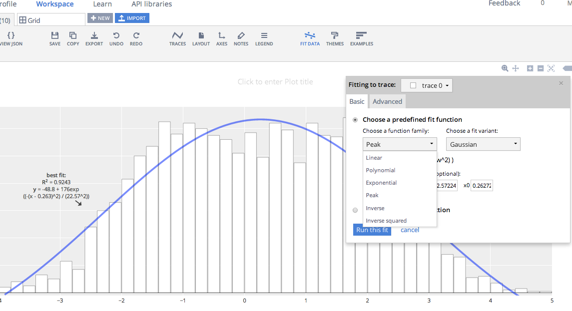
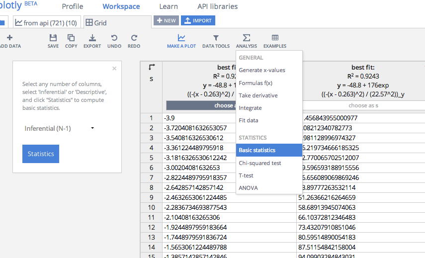
We are inviting you and your colleagues to share your reproducible workflows. We are hoping to collect 20 to 30 case studies covering a range of topics from the social science disciplines and social scientists working in professional schools. Each case study will be short, about 1,500 to 2,000 words plus one diagram that demonstrates the “how” of reproducible research, and follow a standard template of short answer questions to make it easy to contribute a case study. The case study will consist of an introduction (100 -200 words), workflow narrative (500-800 words), “pain points” (200-400 words), key benefits (200-400 words), and tools used (200-400 words). To help facilitate the process we have a template as well as an example of Garret’s case study with accompanying diagram. (Draw.io is an easy-to-use online tool to draw your diagram.)

BITSS will be sponsoring a Summer Institute for Transparency and Reproducibility in the Social Sciences from June 8 – June 10 in Berkeley, CA. On June 9, BITSS will devote a special session to writing up workflow narratives and creating diagrams for inclusion in this edited volume. While the Summer Institute admissions deadline has passed, BITSS may still consider applications from especially motivated researchers and contributors to the volume. BITSS is also offering a similar workshop through ICPSR at the University of Michigan July 5-6.

Attending the BITSS workshop is not required to contribute to the volume. We invite submissions from faculty, graduate students, and post-docs in the social sciences and professional schools.

If you are interested in contributing to (or learning more) about this volume please email Cyrus Dioun (dioun@berkeley.edu) or Garret Christensen (garret@berkeley.edu) no later than May 6th. Completed drafts will be due June 28th.

References

LaCour, Michael J., and Donald P. Green. “When contact changes minds: An experiment on transmission of support for gay equality.” Science 346, no. 6215 (2014): 1366-1369.

Rogoff, Kenneth, and Carmen Reinhart. “Growth in a Time of Debt.” American Economic Review 100, no. 2 (2010): 573-8.

Matt Rafalow is a Ph.D. candidate in sociology at UC Irvine, and a researcher for the Connected Learning Research Network. http://mattrafalow.org/

Tech-minded educators and startups increasingly point to big data as the future of learning. Putting schools in the cloud, they argue, opens new doors for student achievement: greater access to resources online, data-driven and individualized curricula, and more flexibility for teachers when designing their lessons. When I started my ethnographic study of high tech middle schools I had these ambitions in mind. But what I heard from teachers on the ground provided a much more complicated story to the politics of data collection and use in the classroom.

For example, Mr. Kenworth, an art teacher and self-described techie, recounted to me with nerdy glee how he hacked together a solution to address bureaucratic tape that interfered with his classes. Administrators at Sheldon Junior High, the Southern California-based middle school where he taught, required that all student behavior online be collected and linked to individual students. Among the burdens that this imposed on teachers’ curricular flexibility was how it limited students’ options for group projects. “I oversee yearbook,” he said. “The school network can be slow, but more than that it requires that students log in and it’s not always easy for them to edit someone else’s files.” Kenworth explained that data tracking in this way made it harder for student file sharing with one another, minimizing opportunities to easily and playfully co-create documents, like yearbook files, from their own computers.

As a workaround to the login-centered school data policy, Kenworth secretly wired together a local area network just for his students’ yearbook group. “I’m the only computer lab on campus with its own network,” he said. “The computers are not connected to the district. They’re using an open directory whereas all other computers have to navigate a different system.” He reflected on why he created the private network. “The design of these data systems is terrible,” he said, furrowing his brow. “They want you to use their technology and their approach. It’s not open at all.”

Learning about teachers’ frustrations with school data collection procedures revealed, to me, the pressure points imposed on them by educational institutions’ increasing commitment to collect data on student online behavior. Mr. Kenworth’s tactics, in particular, make explicit the social structures in place that tie the hands of teachers and students as they use digital technologies in the classroom. Whereas much of the scholarly writing in education focuses on inequalities that emerge from digital divides, like unequal access to technology or differences in kids’ digital skill acquisition, little attention is paid to matters of student privacy. Most of the debates around student data occurs in across news media – academia, in classic form, has not yet caught up to these issues. But education researchers need to begin studying data collection processes in schools because they are shaping pedagogy and students’ experience of schooling in important ways. At some schools I have studied, like where Mr. Kenworth teaches, administrators use student data to not only discipline children but also to inform recommendations for academic tracks in high school. Students are not made aware that this data is being collected nor how it could be used.

Students and their families are being left out of any discussion about the big datasets being assembled that include online behaviors linked to their children. This reflects, I believe, an unequal distribution of power driven by educational institutions’ unchecked procedures for supplying and using student data. The school did not explicitly prohibit Mr. Kenworth’s activities, but if they found out they would likely reprimand him and link his computers to the district network. But Kenworth’s contention that this data collection processes limits how he can run his yearbook group extends far beyond editing shared yearbook files. It shows just how committed schools are to collecting detailed information about their students’ digital footprints. At the present moment, what they choose to do with that data is entirely up to them.


Pablo Barberá, Dan Cervone, and I prepared a short course at New York University on Data Science and Social Science, sponsored by several institutes at NYU. The course was intended as an introduction to R and basic data science tasks, including data visualization, social network analysis, textual analysis, web scraping, and APIs. The workshop is geared towards social scientists with little experience in R, but experience with other statistical packages.

You can download and tinker around with the materials on GitHub.

Posted in R.

If you’re looking for a good outlet for some computationally-oriented social science work, check out the International Conference on Computational Social Science (IC^2S^2). (Disclaimer: I am on the program committee for this conference). Last year, as the Computational Social Science Summit, the conference attracted 200 participants and had a very vibrant set of panels.

Abstracts are due on January 31, 2016. Hoping to see many of you there!

walker_5.png-large

The graph above recently appeared as part of Scott Walker’s Twitter feed. Presumably, the idea is to suggest that under Walker’s leadership, Wisconsin has done better than the country as a whole when it comes to unemployment, though an alternative version of the ad makes it somewhat more personal, using the same basic figures to suggest that Walker—a Republican presidential candidate—is outperforming sitting Democratic president Barack Obama. In these ads, the Walker campaign repeatedly highlights the fact that the unemployment rate in Wisconsin is lower than the national average. Note, however, that the unemployment rate in Wisconsin was already lower than the national average when Walker took office. In other words, Walker inherited a good labor market. If we want to measure Walker’s effect on the Wisconsin economy, we need to look at changes in the unemployment rate over time.

Continue reading

A few weeks ago I helped organize and instruct a Software Carpentry workshop geared towards social scientists, with the great help from folks at UW-Madison’s Advanced Computing Institute. Aside from tweaking a few examples (e.g. replacing an example using fake cochlear implant data with one of fake survey data), the curriculum was largely the same. The Software Carpentry curriculum is made to help researchers, mostly in STEM fields, to write code for reproducibility and collaboration. There’s instruction in the Unix shell, a scripting language of your choice (we did Python), and collaboration with Git.

We had a good mix of folks at the workshop, many who had some familiarity with coding to those who had zero experience. There were a number of questions at the workshop about how folks could use these tools in their research, a lot of them coming from qualitative researchers.

I was curious about what other ways researchers who use qualitative methods could incorporate programming into their research routine. So I took to Facebook and Twitter.

Continue reading

In network analysis, blockmodels provide a simplified representation of a more complex relational structure. The basic idea is to assign each actor to a position and then depict the relationship between positions. In settings where relational dynamics are sufficiently routinized, the relationship between positions neatly summarizes the relationship between sets of actors. How do we go about assigning actors to positions? Early work on this problem focused in particular on the concept of structural equivalence. Formally speaking, a pair of actors is said to be structurally equivalent if they are tied to the same set of alters. Note that by this definition, a pair of actors can be structurally equivalent without being tied to one another. This idea is central to debates over the role of cohesion versus equivalence.

In practice, actors are almost never exactly structural equivalent to one another. To get around this problem, we first measure the degree of structural equivalence between each pair of actors and then use these measures to look for groups of actors who are roughly comparable to one another. Structural equivalence can be measured in a number of different ways, with correlation and Euclidean distance emerging as popular options. Similarly, there are a number of methods for identifying groups of structurally equivalent actors. The equiv.clust routine included in the sna package in R, for example, relies on hierarchical cluster analysis (HCA). While the designation of positions is less cut and dry, one can use multidimensional scaling (MDS) in a similar manner. MDS and HCA can also be used in combination, with the former serving as a form of pre-processing. Either way, once clusters of structurally equivalent actors have been identified, we can construct a reduced graph depicting the relationship between the resulting groups.

Yet the most prominent examples of blockmodeling built not on HCA or MDS, but on an algorithm known as CONCOR. The algorithm takes it name from the simple trick on which it is based, namely the CONvergence of iterated CORrelations. We are all familiar with the idea of using correlation to measure the similarity between columns of a data matrix. As it turns out, you can also use correlation to measure the degree of similarity between the columns of the resulting correlation matrix. In other words, you can use correlation to measure the similarity of similarities. If you repeat this procedure over and over, you eventually end up with a matrix whose entries take on one of two values: 1 or -1. The final matrix can then be permuted to produce blocks of 1s and -1s, with each block representing a group of structurally equivalent actors. Dividing the original data accordingly, each of these groups can be further partitioned to produce a more fine-grained solution.

Insofar as CONCOR uses correlation as a both a measure of structural equivalence as well as a means of identifying groups of structurally equivalent actors, it is easy to forget that blockmodeling with CONCOR entails the same basic steps as blockmodeling with HCA. The logic behind the two procedures is identical. Indeed, Breiger, Boorman, and Arabie (1975) explicitly describe CONCOR as a hierarchical clustering algorithm. Note, however, that when it comes to measuring structural equivalence, CONCOR relies exclusively on the use of correlation, whereas HCA can be made to work with most common measures of (dis)similarity.

Since CONCOR wasn’t available as part of the sna or igraph libraries, I decided to put together my own CONCOR routine. It could probably still use a little work in terms of things like error checking, but there is enough there to replicate the wiring room example included in the piece by Breiger et al. Check it out! The program and sample data are available on my GitHub page. If you have devtools installed, you can download everything directly using R. At the moment, the concor_hca command is only set up to handle one-mode data, though this can be easily fixed. In an earlier version of the code, I included a second function for calculating tie densities, but I think it makes more sense to use concor_hca to generate a membership vector which can then be passed to the blockmodel command included as part of the sna library.

#REPLICATE BREIGER ET AL. (1975)
#INSTALL CONCOR
devtools::install_github("aslez/concoR")

#LIBRARIES
library(concoR)
library(sna)

#LOAD DATA
data(bank_wiring)
bank_wiring

#CHECK INITIAL CORRELATIONS (TABLE III)
m0 <- cor(do.call(rbind, bank_wiring))
round(m0, 2)

#IDENTIFY BLOCKS USING A 4-BLOCK MODEL (TABLE IV)
blks <- concor_hca(bank_wiring, p = 2)
blks

#CHECK FIT USING SNA (TABLE V)
#code below fails unless glabels are specified
blk_mod <- blockmodel(bank_wiring, blks$block, 
     glabels = names(bank_wiring),
     plabels = rownames(bank_wiring[[1]]))
blk_mod
plot(blk_mod)

The results are shown below. If you click on the image, you should be able to see all the labels.

bank_blocks

[Note: I do realize that this event was nearly two months ago. I have no one to blame but the academic job market.]

On August 15 and 16, we held the first annual ASA Datathon at the D-Lab at Berkeley. Nearly 25 people came from academia, industry, and government participated during the 24-hour hack session. The datathon focused on open city data and methods, and questions surrounded issues such as gentrification, transit, and urban change.

Two of our sponsors kicked off the event by giving some useful presentations on open city data and visualization tools. Mike Rosengarten from OpenGov presented on OpenGov’s incredibly detailed and descriptive tools for exploring municipal revenues and budgets. And Matt Sundquist from plot.ly showed off the platform’s interactive interface which works across multiple programming environments.

Fueled by various elements of caffeine and great food, six teams hacked away through the night and presented their work on the 16th at the Hilton San Francisco. Our excellent panel of judges picked the three top presentations which stood out the most:

Honorable mention: Spurious Correlations

The Spurious Correlations team developed a statistical definition for gentrification and attempted to define which zip codes had been gentrified by their definition. Curious about those doing the gentrifying, they asked if artists acted as “middle gentrifiers.” While this seemed to correlate in Minneapolis, it didn’t hold for San Francisco.

Second place: Team Vélo 

Team Vélo, as the name implies, was interested in bike thefts in San Francisco and crime in general. They used SFPD data to rate crime risk in each neighborhood and tried to understand which factors may be influencing crime rates, including racial diversity, income, and self-employment.

First place: Best Buddies Bus Brigade

Lastly, our first place winners asked “Does SF public transportation underserve those in low-income communities or without cars?” Using San Francisco transit data, they developed a visualization tool to investigate bus load and how this changes by location, conditional on things like car ownership.

You can check out all the presentations at the datathon’s GitHub page.

Laura Nelson, Laura Norén, and I want to give a special thanks to our sponsors: OpenGov, UC Berkeley Sociology, UW Madison Sociology, the D-Lab, SurveyGizmo, the Data Science Toolkit, Duke Network Analysis Center, plot.ly, orgtheory, Fabio Rojas, Neal Caren, and Pam Oliver.

This is a guest post by Matt Sundquist. Matt studied philosophy at Harvard and is a Co-founder at Plotly. He previously worked for Facebook’s Privacy Team, has been a Fulbright Scholar in Argentina and a Student Fellow of the Harvard Law School Program on the Legal Profession, and wrote about the Supreme Court for SCOTUSblog.com.

Emailing code, data, graphs, files, and folders around is painful (see below). Discussing all these different objects and translating between languages, versions, and file types makes it worse. We’re working on a project called Plotly aimed at solving this problem. The goal is to be a platform for delightful, web-based, language-agnostic plotting and collaboration. In this post, we’ll show how it works for ggplot2 and R.


Email


A first Plotly ggplot2 plot


Let’s make a plot from the ggplot2 cheatsheet. You can copy and paste this code or sign-up for Plotly and get your own key. It’s free, you own your data, and you control your privacy (the set up is quite like GitHub).


install.packages("devtools") # so we can install from github
library("devtools")
install_github("ropensci/plotly") # plotly is part of the ropensci project
library(plotly)
py <- plotly("RgraphingAPI", "ektgzomjbx")  # initiate plotly graph object

library(ggplot2)
library(gridExtra)
set.seed(10005)
 
xvar <- c(rnorm(1500, mean = -1), rnorm(1500, mean = 1.5))
yvar <- c(rnorm(1500, mean = 1), rnorm(1500, mean = 1.5))
zvar <- as.factor(c(rep(1, 1500), rep(2, 1500)))
xy <- data.frame(xvar, yvar, zvar)
plot<-ggplot(xy, aes(xvar)) + geom_histogram()
py$ggplotly()  # add this to your ggplot2 script to call plotly


By adding the final line of code, I get the same plot drawn in the browser. It's here: https://plot.ly/~MattSundquist/1899, and also shown in an iframe below. If you re-make this plot, you'll see that we've styled it in Plotly's GUI. Beyond editing, sharing, and exporting, we can also add a fit. The plot is interactive and drawn with D3.js, a popular JavaScript visualization library. You can zoom by clicking and dragging, pan, and see text on the hover by mousing over the plot.


Here is how we added a fit and can edit the figure:


Fits


Your Rosetta Stone for translating figures

When you share a plot or add collaborators, you're sharing an object that contains your data, plot, comments, revisions, and the code to re-make the plot from a few languages. The plot is also added to your profile. I like Wired writer Rhett Allain's profile: https://plot.ly/~RhettAllain.
Collaboration
You can export the figure from the GUI, via an API call, or with a URL. You can also access and share the script to make the exact same plot in different languages, and embed the plot in an iframe, Notebook (see this plot in an IPython Notebook), or webpage like we've done for the above plot.
  • https://plot.ly/~MattSundquist/1899.svg
  • https://plot.ly/~MattSundquist/1899.png
  • https://plot.ly/~MattSundquist/1899.pdf
  • https://plot.ly/~MattSundquist/1899.py
  • https://plot.ly/~MattSundquist/1899.r
  • https://plot.ly/~MattSundquist/1899.m
  • https://plot.ly/~MattSundquist/1899.jl
  • https://plot.ly/~MattSundquist/1899.json
  • https://plot.ly/~MattSundquist/1899.embed
To add or edit data in the figure, we can upload or copy and paste data in the GUI, or append data using R.
Stats
Or call the figure in R:
py <- plotly("ggplot2examples", "3gazttckd7") 
figure <- py$get_figure("MattSundquist", 1339)
str(figure)
And call the data:
figure$data[]

That routine is possible from other languages and any plots. You can share figures and data between a GUI, Python, R, MATLAB, Julia, Excel, Dropbox, Google Drive, and SAS files.

Three Final thoughts

  • Why did we build wrappers? Well, we originally set out to build our own syntax. You can use our syntax, which gives you access to the entirety of Plotly's graphing library. However, we quickly heard from folks that it would be more convenient to be able to translate their figures to the web from libraries they were already using.
  • Thus, Plotly has APIs for R, Julia, Python, MATLAB, and Node.js; supports LaTeX; and has figure converters for sharing plots from ggplot2, matplotlib, and Igor Pro. You can also translate figures from Seaborn, prettyplotlib, and ggplot for Python, as shown in this IPython Notebook. Then if you'd like to you can use our native syntax or the GUI to edit or make 3D graphs and streaming graphs.
  • We've tried to keep the graphing library flexible. So while Plotly doesn't natively support network visualizations (see what we support below), you can make them with MATLAB and Julia, as Benjamin Lind recently demonstrated on this blog. The same is true with maps. If you hit a wall, have feedback, or have questions, let us know. We're at feedback at plot dot ly and @plotlygraphs.
Charts

The past two years we’ve had our own Bad Hessian shindig, to much win and excitement. This year we’re going to leech off other events and call them our own.

The first will be the after party to the ASA Datathon. We don’t actually have a place for this yet, but judging will take place on Saturday, August 16, 6:30-8:30 PM in the Hilton Union Square, Fourth Floor, Rooms 3-4. So block out 8:30-onwards for Bad Hessian party times.

The second place you can catch us is with the rest of the sociology blog crowd at Trocadero Club, Sunday, August 17, at 5:30 PM.

If you haven’t had enough, you can probably catch many of us at ASA Karaoke 2014: Computational Karaoke in the Age of Big Data. Bonus points for singing the most “big data” of songs.